I’ve spoken to a lot of founders who are obsessed with their dashboards.
DAUs. MAUs. Retention curves. The graph goes up and to the right. Everything looks fine.
Then a big client churns. Or nobody comes back after Day 1. Or the product quietly dies despite the numbers looking healthy.
Sound familiar?
Here’s what I’ve come to believe after building multiple products and watching hundreds of startups:
Your aggregate metrics are hiding the most important information you have.
And there’s a simple fix. It takes 10 minutes to build. It requires no fancy analytics tool. And it will show you more about your users than any dashboard ever has.
It’s called a dot plot.
What’s Actually Wrong with DAU and MAU
Let me be direct about something.
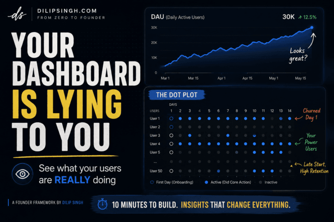
If your product is growing at all — even slowly — your DAU graph will go up.
New users sign up at the top. Some stay. Most don’t. But as long as new people keep arriving, the line keeps climbing.
The problem? The line can’t tell you what’s actually happening underneath.
It can’t tell you:
- Which users came back every day vs. which ones never returned
- Whether your power users are 3 people or 300
- If the users who churn are doing so on Day 1 or Day 30
- Which features are actually driving retention
You can’t see any of that in a DAU graph.
As David Lieb, a General Partner at Y Combinator who built Google Photos, puts it: “You can’t really get a sense of what any individual user is doing” from an aggregate chart.
And that blind spot is dangerous. Especially early on.
The $80,000 Contract Nobody Watched
Let me tell you a story.
A YC-backed B2B startup won an $80,000/year contract. Big customer. Brand-name company. 10 seats purchased.
Everyone was celebrating.
Six months later, the contract churned.
When they looked back, the signals were all there, they just weren’t looking in the right place:
- Only 3 of the 10 seats ever activated
- None of those 3 users engaged more than 2 days per week
- Usage was sporadic and declining
- The internal champion who bought the product had quietly left the company
The ARR dashboard showed a healthy logo count. Revenue looked fine. There was no red flag in sight.
But the individual user behavior told a completely different story.
If they had been watching individual users, not just aggregate numbers, they could have intervened months before renewal.
That’s exactly what a dot plot is designed to catch.
So What Is a Dot Plot?
A dot plot is embarrassingly simple.
It’s a two-dimensional grid where:
- Every row = one user
- Every column = one day
- A filled dot = the user did the core value action on that day
That’s it.
No algorithm. No regression model. Just your event logs turned into a grid your eyes can read in seconds.
Here’s what it might look like for a simple SaaS product:
User A  ● ● ● ● ● · · ● ● ● ● ●
User B  ◎ · · · · · · · · · · ·
User C  ◎ ● · ● · ● · · ● · · ·
User D  ◎ ● ● ● ● ● ● ● ● ● ● ●
User E  · · · · · · ◎ ● ● ● ● ●

● = active day   ◎ = first day (onboarding)   · = inactive
In 10 seconds of looking at this grid, you can already see:
- User B activated once and never came back — that’s a Day 1 churn problem
- User D is your ideal user — daily habit from Day 1
- User E started late but then became very consistent — something clicked
- Users A and C are occasional users — maybe weekend-only, maybe low-frequency by nature
Now imagine seeing this for all 50 or 200 of your early users at once.
Your brain will spot patterns that no aggregate chart would ever surface.
The One Rule for Picking Your Event
Here’s where most founders go wrong.
They track the wrong event.
“Opened the app” — wrong. “Signed in” — wrong. “Visited the dashboard” — wrong.
These are vanity metrics. They tell you the user showed up. Not that they got anything out of it.
The event you track should represent real value delivered.
Ask yourself: what is the one thing a user has to do for your product to have actually worked for them today?
- Spotify → listened to a song
- Google Photos → shared a photo
- An invoicing tool → processed an invoice
- A learning app → completed a lesson
- A task manager → marked a task complete
That’s your event. One. And only that one.
If you pick a softer event, your dot plot will be full of dots that don’t mean anything — and you’ll miss all the users who are quietly leaving without ever getting value.
What Patterns Will You Actually See?
Once you have the grid up, your eyes will start finding things automatically.
1. One-day churn clusters Rows with a single dot at the onboarding moment, then silence. These users came in and left before getting value. A cluster of these tells you your onboarding is broken.
2. Weekday vs. weekend users Some rows light up Monday–Friday. Others only on weekends. These are two completely different use cases hidden inside one product. Now you can talk to them separately.
3. Feature-driven retention When you add a letter inside a dot to mark secondary features — like “P” for joining a playlist or “S” for using search — you can see which features precede long active streaks. That’s your retention engine. Double down on it.
4. Seat activation in B2B For any B2B product, sort rows by company. Instantly see which companies have 8 of 10 seats active and which have 2 of 10. Don’t wait for renewal to find out.
None of this requires a data scientist. Just a grid and your own eyes.
How to Build One (Seriously, 10 Minutes)
You don’t need Mixpanel or Amplitude for this.
You need:
- Your event logs (any database table that records
user_id,event_name,date) - A quick script to pivot that into a grid
- Something to display it — even a Google Sheet works
Modern AI coding tools (like Claude, Cursor, or ChatGPT) can build this for you in a few minutes. Just describe the structure: rows = users, columns = days, fill a cell if the user performed [your event] on that day.
Until you have hundreds of users, this dot plot can be your only analytics dashboard.
It tells you more than any pie chart ever will.
What About When You Scale?
You might be thinking: “This works for 50 users. What about 50,000?”
Fair question.
The answer is sampling.
David Lieb used dot plots at Google Photos when they had over a billion users. His team would print out physical dot plot sheets — each one representing a specific user segment. iOS users in France. Web users in the US earning above a certain income. New users from a paid campaign.
Team members would sit with those sheets, look at the patterns, and annotate what they noticed.
You don’t need to see every user. You need to see representative slices. And you need to actually look.
The Dot Plot vs. Your Retention Curve
Let me be clear: I’m not saying throw away your cohort curves.
Both tools do different jobs.
Your retention curve tells you whether users are sticking. It flags the problem.
Your dot plot tells you how users are engaging. It explains the mechanism.
You need both.
Retention curve: “Our Week 3 retention is unusually low.” Dot plot: “Users who never used the search feature in their first week almost never come back after Day 7.”
Now you have something to act on.
My Takeaway for Founders
I’ve built startups. I’ve watched startups fail. I’ve talked to hundreds of founders about their products.
One of the most common patterns I see is founders who know their aggregate numbers perfectly and have no idea what’s happening with actual individual users.
They can tell you DAU. They can’t tell you what their three most active users did yesterday.
That’s a problem.
The dot plot is the fastest, cheapest way I’ve seen to close that gap.
You don’t need a data team. You don’t need a tool subscription. You need 10 minutes and your own event logs.
Build it this week. Spend 20 minutes staring at it. I promise you’ll find something surprising.
And that surprise is what leads to better products.
Inspired by David Lieb’s Startup School lecture for Y Combinator: “Dot Plots: How to Actually See What Your Users Are Doing.” If you haven’t watched it, I strongly recommend adding it to your list.
Found this useful?
Share it with a founder friend who’s staring at their DAU graph and wondering why nothing’s working.
→ Follow me on X @dilip_singhk for more founder frameworks like this.


